Banking explained
Research-based website redesign project for the market leader bank in Hungary with 3 million customers.
Work done at Mito, a full-service agency based in Budapest.
The Client
OTP Bank, the largest financial service provider in Hungary, decided to make banking easier and more understandable for its 3 million clients.
My Role
I was the lead designer of the project on the design agency’s side, coordinating a team of 4 UX designers, 2 UX researchers, a UI designer, and a copywriter.
I was directly involved in user research, facilitating co-creation workshops, content design, accessibility, wireframing, prototyping, and usability testing.
Research
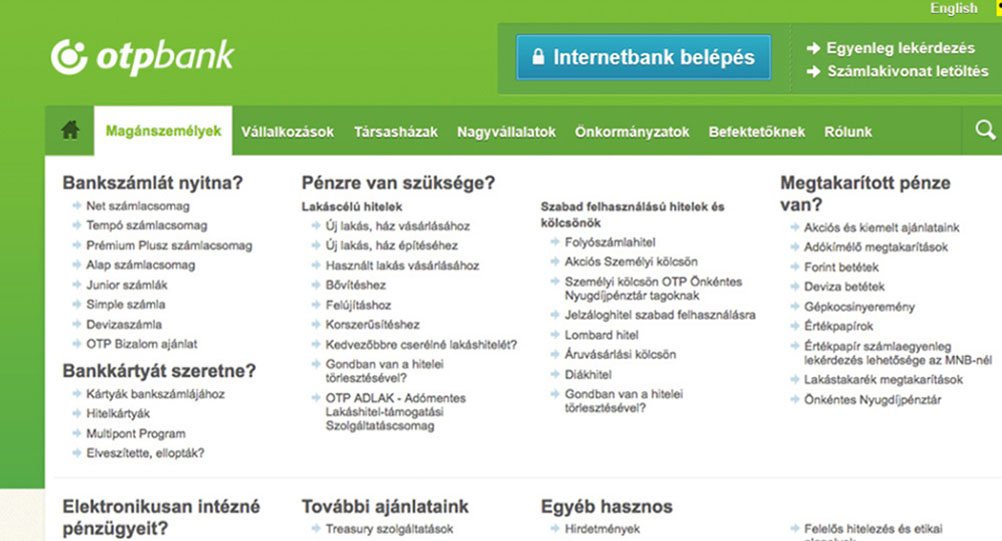
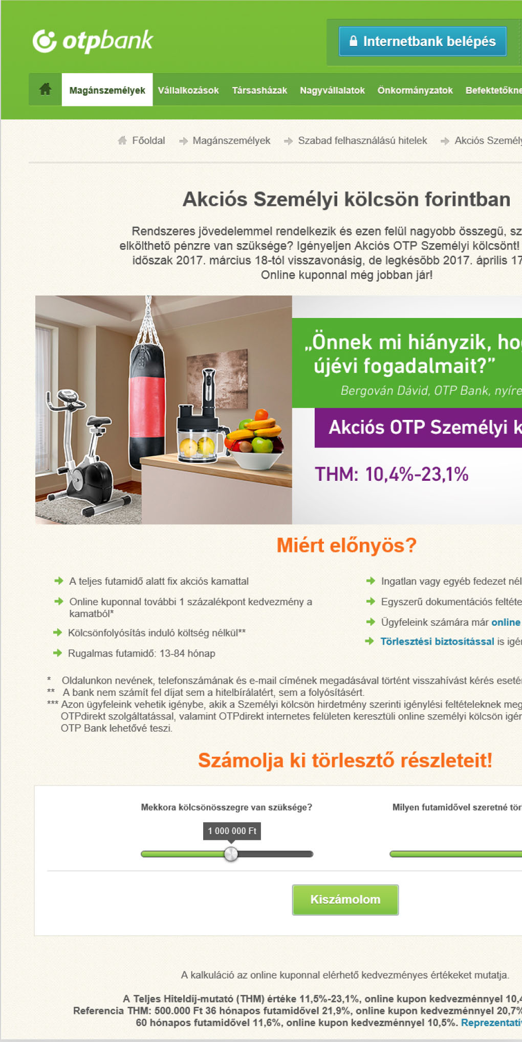
During the interviews with customers and client-facing employees, the team found out that the website's technical and legal wording was one of the main issues and steered less savvy customers away.
Usability tests showed that the website’s structure was hard to follow, a major blocker for conversions.
Design
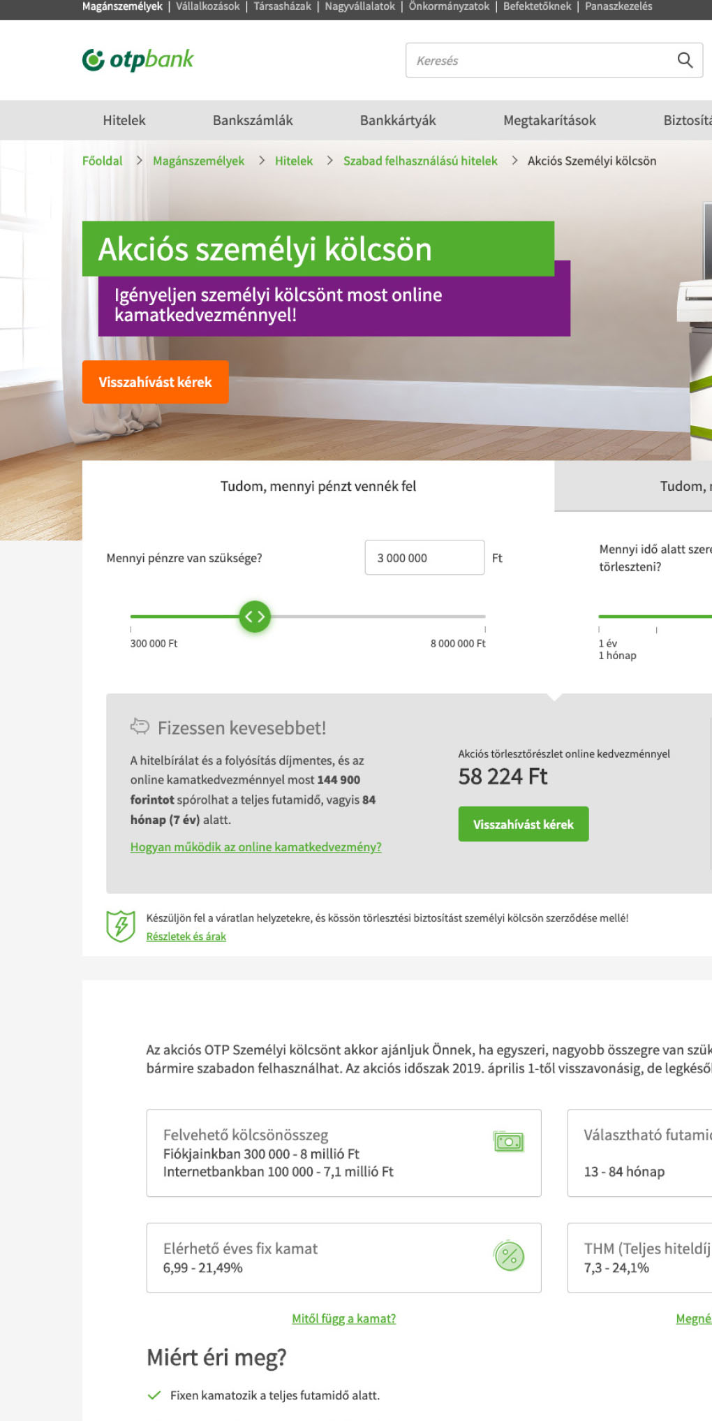
The card sorting studies and web analytics gave us insights to redesign the website's information architecture, leading to straightforward navigation.
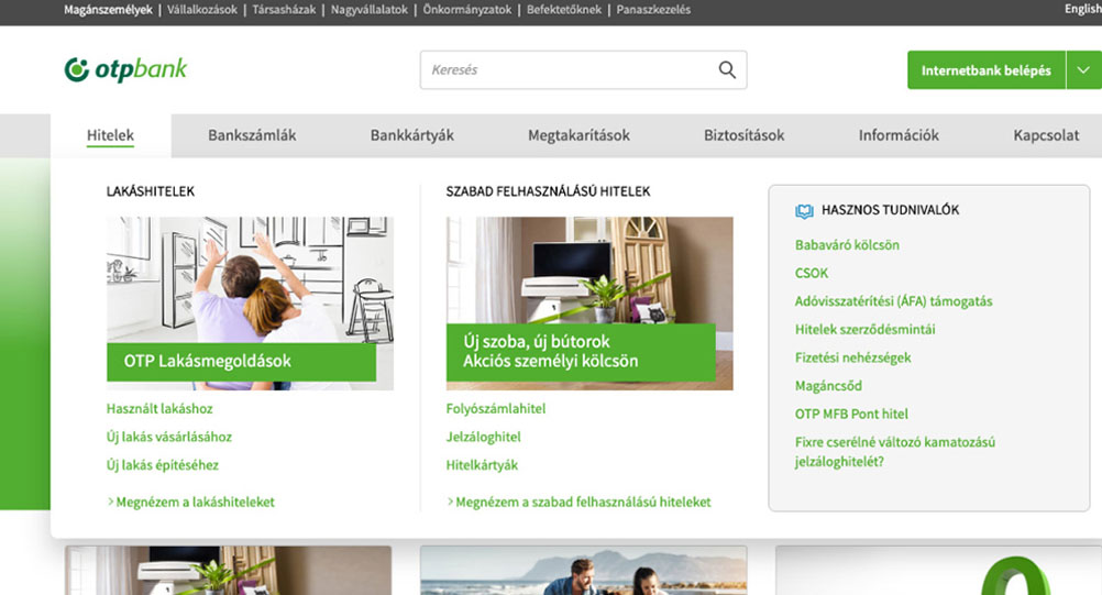
We studied every product and service, which helped us rewrite all the content using plain language.
We took accessibility seriously and designed every bit of interaction with an inclusive mindset.
After every major section, we went back to our customers and tested the designs and content to see if we are going in the right direction.
Results
Double-digit rise in the number of leads generated from the main page.
0.5x average time needed to reach a product page.
According to a recent test amongst 9 Hungarian banks, information about the costs of bank card usage is the easiest to find and understand on OTP Bank’s website.
Source, Association of Conscious Consumers, (Hungarian only)
Say hello
Email: hello@imbence.com
Twitter: @beeeraj